Assignments_UI Challenge 4_Mini Mobile App
Analysis
Analysis 1
Beauty Service App

Function:
This is a beauty service app in which users can easily find beauty specialists near their location. Users can also quickly calculate the time for procedures and plan their day correctly while booking for appointment.
Visual Aesthetic & Communication:
The visual design is simple and clean, with delightful and fresh color palette. The animation is smooth and breathtaking. The overall design is in line with the beauty service.
Interactivity:
The interaction of this app is well designed. The animations such as 'slightly' bouncing text, popped out pin on the map and the like, can be seen obviously when users click on the buttons. The timing is finely tuned so that users don't have to wait for the animations to pass to continue the next step.
Usability & Engagement:
The usability of this interactive design is great as it is easy to navigate and easily understand by the users. The combination of animations and UI elements like swipe, drag and click is able to improve users' engagement.


Analysis 2
Coffee App

Function:
This coffee ordering app is designed for users to order coffee according to their own flavors. Users can view the relevant information about each coffee and customize their own coffee at the same time.
Visual Aesthetic & Communication:
The visual of this interactive is clean and pleasing to look at, using analogous colors of the packaging of the selection coffee as the background color. The whole UI layout looks great, it looks slightly different to other beverage or food ordering app as it provides some extra information and knowledge about each coffee, and attaches option to adjust ingredients.
Interactivity:
The animation is pretty simple, nothing fancy but users are able to understand what they are pressing. The way it determine the composition of the coffee is just right and smooth. Also, the background color of the coffee changes whenever swipes to the other coffee.
Usability & Engagement:
The usability of this UI is friendly and straight forward, every label is clearly stated. There is no much feedback but for me, the color changes is already engaging. Overall, everything looks great to a coffee ordering app.
Analysis 3
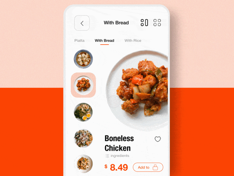
Food Ordering App
Function:
The function of this interactive is for users to order food. It is similar to other food ordering apps like Food Panda. Users are able to add selection to cart and adjust the quantity.
Visual Aesthetic & Communication:
Everything looks clean and organized with minimal color scheme. The UI layout is intuitional, different options are placed at the left, and the information of selected dish showing at the right side while users scrolling through those options.
Interactivity:
The interactivity of this app is appealing. The animation transition between dishes changes looks interesting. The dish icon (or photo) which appear in the cart increase when users add on the quantity, it is a cute idea, but just wondering how it would look like when the quantity is more than 3 because it looks a little crammed already.
Usability & Engagement:
The usability of this app is fine and cohesive. Overall the experience is engaging, maybe just the ordering cart can be improved as mentioned before.
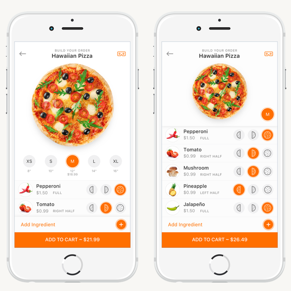
UI Challenge 4
For this challenge, I want to make an app that allows users to customize and order their ramen. This idea was inspired by a ramen restaurant which is placed in Japan. The restaurant only focus on one type of food which is ramen and they provide a form to customer to customize and select their preferences.
References
Sketch
Final Visual
This is the final visual of the interactive. The preferences items that I applied in this interactive are mostly referred to the menu form of the Japan restaurant. The interactive has checkboxes for users to select noodles textures and toppings, and a slider is to adjust the sauce. The feedback will appear in or above the bowl with the visual changes based on users' choices. The price will only be shown in the last customization page so that users might not forgot, and the price is fixed with or without toppings.
In terms of animation, I animate the background elements a bit, I also animate the toppings position where it will move in or out of the screen according to users' selection.
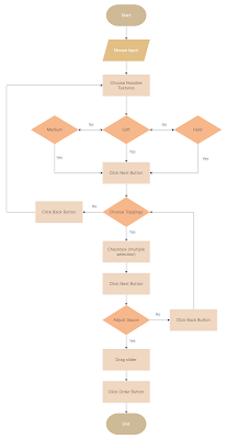
Flowchart
Video Capture
Self Evaluation
I think this challenge is quite challenging for me because of making two or more scene linkable, and having time management issue at the same time. I think the whole layout can be improved especially for the feedback, maybe can make them more consistent so that users don't confuse. Other than that, it is a good try for me and I feel like my skills and knowledge towards coding and interactive design has certainly improved.


Comments
Post a Comment