Assignments_UI Challenge 1_Button
Analysis
Analysis 1
Sent Button

Function:
This is a simple sent button with input control which allow users to send something like messages to others.
Visual Aesthetic & Communication:
The visual design is simple and clean, with strong contrast colors. It has a smooth animation and the overall icon has a minimal and flat aesthetic to it.
Interactivity:

Mouse hovered: The airplane icon is blue in color, the word 'send' is labeled on the button.
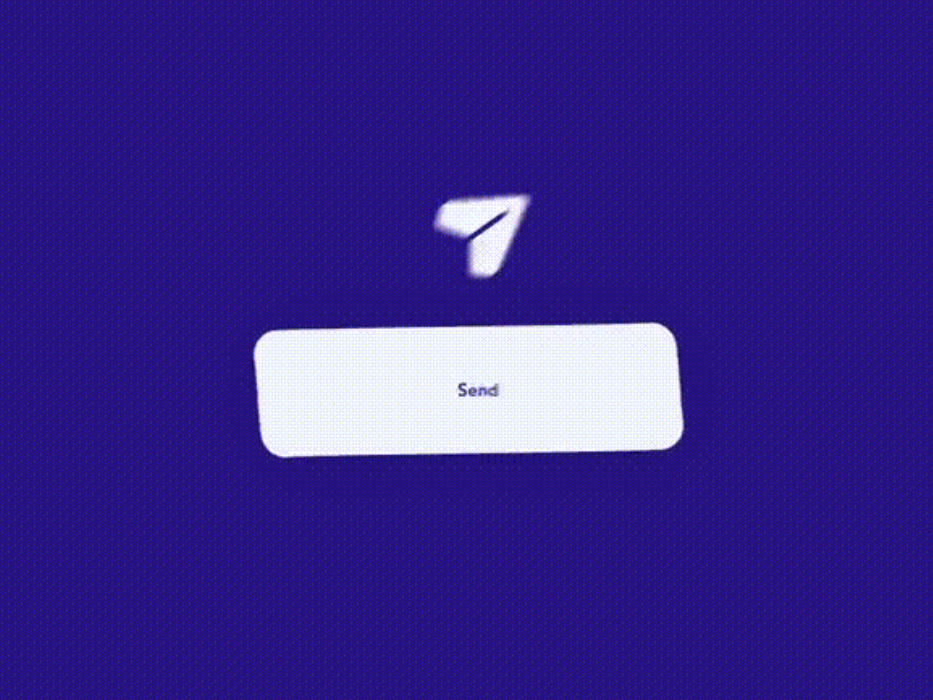

The button labeled with 'sent' instead of 'send' and the airplane becomes a tick to represent users successfully sent.
Usability & Engagement:
The usability of this design is friendly as it has a strong indication between two different state (before and after sent). The animation really drives up the engagement for the users as well as the interactive experience.
Airplane Mode Toggle Button

Function:
This is a toggle button with input control function. Users can switch between two state which is airplane mode on or off.
Visual Aesthetic & Communication:
Nothing complicated with the visual design, simple shapes but message is clear since it is applied with illustration and a bit animation to improve users' experience.
Interactivity

Toggle button at the left side: airplane mode off, toggle background filled with airport land scene, animation can be seen in the street light.

Toggle button at the right side: airplane mode on, sky scene with clouds animation is shown in the background.
Usability & Engagement:
The usability of this toggle button is great. It is simple enough to understand even though it doesn't include text or label. The animation in the background also makes the user experience more interactable.
Loading

Function:
This is a loading spinner with information components, similar to progress bar. Its purpose is to visualize user's progression so it's not clickable.
Visual Aesthetic & Communication:
The visual design looks clean and immersive by using fresh green color. The spinner is designed in 3D so it looks way more interesting and so with the breathtaking animation.
Interactivity
The 3D spinner keeps looping up and down.
Usability & Engagement:
The usability of this loading spinner is awesome due to its simplicity and smooth animation, everything is well designed. It might make impatient user calmer and boost engagement.
UI Challenge 1
I want to create a UI that users can choose their game character. The theme I choose for this challenge is Harry Potter. Left and right button is designed to let users to switch for different choices. I added button function into the character itself for users to see additional info which is the pet of the character. Lastly, a confirm button is for users to confirm their selection.

References


Flowchart

Video Capture
Round 1
Self Evaluation
The overall design has a flat aesthetic, I try to keep everything simple since I just started to get a hang on with coding. I think the outcome of this challenge is not too bad although I was just using the simplest way which is the 'SetActive', it executes in my ideal way.
In conclusion, the visual can be more refined and for me, the interactive has slightly improve during round 2.

Comments
Post a Comment