Assignments_UI Challenge 2_Slider
Analysis
Analysis 1
Liquid Slider

Function: Value selection (degree / °)
Coherent: The slider is designed as a graduated cylinder to let users know it’s a vertical slider. While the marked line on the graduated cylinder represents tick mark. One thing is users may be confused on where to drag (bubble or cylinder).
1. Graphic Asset: Oval callout
2. Color: More rainbow gradient colors appear as the degree increases.
3. Text/Label: The degree is shown in the oval callout.
4. Animation: Wave effect on the water.
5. Position


Almost a complete rainbow gradient shown when degree getting higher.
Usability & Engagement: For me, overall is well designed. The colors are eye-pleasing, the percentage is labeled clearly and the tick mark helps users to adjust the value easier. May be a thumb added can help too.
Analysis 2
Brightness Slider

Purpose: To adjust the brightness of lamp.
Function: Value selection (%)
Coherent: The word “brightness” is labeled clearly on the top left corner to let users understand the function of this slider. The thumb is big enough to let them know they can drag but the bar for me is somehow too light.

Low% : blue background, white text, high opacity


Analysis 3
Emoji Chooser Slider

Purpose: To choose emoji.
Function: Visual selection (emoji)
Coherent: Users can easily understand its function by seeing the emoji. However, users might feel unsure about they need to drag or to tap jump for different choices, or both action are allowed.
1. Graphic Asset: Oval callout pops out above the chosen emoji.
2. Opacity: The emoji on either side of the selected emoji have less opacity.
3. Scale: The selected emoji has a larger scale.
4. Text/Label: The label is displayed in the oval callout.
5. Animation: The oval callout disappear with a firework effect while swiping away the option.
6. Position

The emotion is labeled above users’ selection
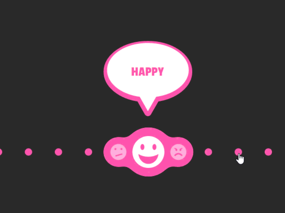
Users click the discrete selection

The emojis slide towards the new selection, the previous label disappeared

New selection increases in scale, new label pops out
Usability & Engagement: It’s a creative idea to make emoji chooser in slider. But for me, it would be better if all the other emojis are displayed all the way instead of replaced them with circles and let users to guess.
UI Challenge 2


Flowchart

For round 2, I fixed the brightness slider that didn't really work for round 1. I also fixed the error code for the mute toggle since the volume couldn't remain as before when unmuted.


Comments
Post a Comment